Tuesday, 2 January 2024

Things I Enjoyed About Design In 2023

As we take another journey around the sun, it's often a time we choose to reflect on our work, the work of  others and what we would like to accomplish in the coming years. 

I wanted to take the opportunity to sum up some of the delightfulness of being a Graphic Designer, the things I enjoyed in 2023 and the things I did not. Being fairly young and new to the field, I still have much more to experience, therefore find I am still experiencing many things for the first time. I feel it's always beneficial to reflect on progress and what has been achieved, often times it can feel you are not moving, but reflecting can show you how far you have come. 

Not only reflecting on myself, but how I have seen the industry and other creatives progress and change over the course of the year has been very enjoyable and I would like to share my findings here. 

Things I enjoyed:

A greater awareness of burnout

Though working within the creative professions definitely has its perks, there has been a greater awareness of burnout just as other years. I found it more common to find my favourite creatives experiencing this this year, with algorithms and new social media tactics being more demanding than ever before. It's been great to see and hear people talking about this and how they have been dealing with burnout. It can be a demanding industry to always be creating, but there is always great importance in a break to get fresh perspective.

Working together/collaborations

There is a lot of scare tactics and posts doing the rounds about new technologies within the creative industries. It's been good to still seeing creatives coming together and creating something new, authentic and has the feel that it has been handmade and crafted with great brainpower and time intensity. Though some ways of working may get quicker in the future industry, I have enjoyed seeing others creating sheerly for the fun of the work and working together, instead of trying to make work quicker. I like knowing I am seeing something that someone has someones passion all over it, and it definitely has shown in the work I have seen.

Making things for the sheer fun of it, not the algorithm

Heck, this blog so far only seems to reel in a couple of readers. Though it is not earning me any money nor have I seen any prospective work come from it, it's something I enjoy. Creating something and sharing something you enjoy and are passionate about is something I have learned is still a great feat, even if it is just for yourself. You gave it a go, learn something new a long the way. With how fast the online world moves, it's easy to feel something has flopped in numbers or is pointless when comparing yourself to others. I have definitely seen a greater awareness made of this online, and that it's okay to feel this way. Everyone deserves to enjoy the work they create and feel passionate about it, even if it's something just for them, it was worth it. 


So design trends...

At the start of 2024 and end of 2023, there are many articles that go round such as "predicted trends of 2024" and "what design trends you should follow" etc. However, I think these three trends should be what we really follow, creating straight from our own noggins. We're addicted to media and we can't help it when it's often in our faces during our day job. Let's switch off a little bit and then when we're ready come back to our machines and create with fresh perspective. I hope it carries on being more of a thing to take a break from technology and come back later. 

This is just my two pence! I look forward to the work I see from myself and others in 2024. Let's make it a good one

Tuesday, 5 December 2023

Funny Things I've Generated Using Generative Fill in Photoshop

After delving into generative AI tool in Photoshop, I decided to put Generative Fill to the test and generate some funny and some nightmarish solutions of my own. Below you will see some of the outcomes. Generative fill creates 3 solutions, I have chosen the most fitting to post here. Generative fill as you will see, can be scarily accurate and other times just hilariously wrong it its outcome. It's not quite there yet in terms of accuracy, but it won't be long until an update comes along making it so. 


A happy ferret

This solution is rather fitting. I don't have any issues with the image above, the ferret is smiling though unrealistic. I did not give the AI any other words/directions, therefore its done a decent job. 


A dog riding a pink scooter through traffic on a rainy day

As you will see, the majority of this list is animal themed, to keep things light and humorous. They also seem to be the most fun to generate, being their limbs work differently to ours, so it is fun to see how the AI presents these doing human things. Though you will see above, in this example it has done a stellar job. Though I would argue that the dog isn't riding a scooter, but a hoverboard. Nonetheless, shown this picture to someone years ago they would have possibly believed this was real. 


Cat conducting a choir

Interestingly, the AI has decided to dress up a cat in a formal blazer. I suppose this goes with the formal attire you may traditionally see on a conductor. Though it is just a cat, wherever the AI bases its images on will always deem to be biased toward a certain class/way of dressing etc, as it will be based off whatever it has. Therefore wherever its information for conductors comes from, they are classy!


Capybara flying a plane

In the summer I had an obsession with Capybaras, therefore I thought it was only right to generate some capybaras doing things. Seeing as I had just gone away, I thought to generate it on a plane or flight. No solutions showed the capybara on a plane, but they were all plane-beings instead. This was kind of cool to see and the wings work really well. They are not plane wings but animal wings. Perhaps we have just spawned a digital species of flying capybara.


Eerie colourful city skyline

The game City Skylines was my inspiration for this one. Often times colourful can seem counterintuitive when talking about the scary and eerie, so I wanted to try the two together. Photoshop has done a fantastic job and morphing an eerie looming skyline with a nice colourful sunset. I have seen digital artists who Illustrate in a similar way. Therefore I think it's always important to fact check the artist and their workflow, as I would have possibly fallen for this on Instagram. 


Capybara riding a bicycle

Another episode of "Capybaras Doing Things." This time I generated a Capybara riding a bike. This was the most realistic one, however notice there are no pedals etc, though their feet are in the right places. The capybara has been propped on the bike like a saddle. It's not a good generated solution but definitely one to show. 


Shrimp Chimpanzee (Shrimpanzee)

This is an illustration idea I had had in my head for a longtime, being shrimp and chimp rhyme. What Photoshop has generated is the exact opposite of what I would be going for... THIS IS NIGHTMARE FUEL. Why does it have a hard shrimp shell with chimp eyes? It's quite threatening and hard to look at. 


Cute little spider sitting in the sun reading a book cartoon

I wanted to try adding a style to see how the fill would interpret it. The illustration it has created is really great in terms of speed, however I wouldn't say this was the kind of cute I was going for. There may be someone out there who would find this fits the brief, though for me it's far from what I wanted. The day isn't sunny and quite frankly its eyes are a little garish. 

One of the many things that separates Illustrators apart from AI is during the process of onboarding a client, they can pick up on cues other than words etc that can help finding out what a client is looking for. AI can only pick up on words, therefore Art and Design workers will always been one ahead of an AI. The service is tailored. Clients often cannot put into words what they want, it is the workers who show and tell their abilities and eventually come to a final solution. The industry is going to be just fine. 

Though I do find the new abilities to do this fun and possibilities endless... I don't think it'll take over just yet.


Saturday, 2 December 2023

How I Feel About Photoshop's Generative Fill

Generative Fill in Photoshop has been a widely discussed topic, as well as AI in general. If you are not sure what Generative Fill is, it is a new tool in Photoshop to which you can select an area, and instead of Content Aware fill etc, you can opt for Generative Fill, to which you can type words to instruct Photoshop on how you would like it filled. 

(There is also the option to leave it blank and let Photoshop figure out for itself. However so far, I find the outcomes of this way to be quite garish)

Within design, this has many advantages and disadvantages. I have heard first hand that many Agencies are beginning to offer the use of AI within their client's outcomes. If it is going to be both widely-used and widely available, why shy away from it? A good Agency and Designer understandable needs to stay current and change with the industry, in order to offer the most cutting-edge and modern service for customers. 

I have been struggling to use Generative Fill. If I have been able to create anything I deem usable, it is still evident as of the date this post has been written that it is not quite right. Some of the generated images are not accurate in terms of both size, realism and the fit to the selection surroundings. It is particularly obvious when generating faces or parts of faces. Though, through research I am aware there are other AI programmes/software that can achieve real likeness and this is scary. 

However, one has to wonder where the inspiration for the AI's outcomes is coming from, and how will this look for the future of copyright. These were my two greatest concerns. I also am curious as to how this will also look for the future of the work involved in Graphic Design, and whether this whole process in the future will become at some point automated.

I began to collate a list of advantages and disadvantages, however I realised as I was writing how conflicted I was on the topic and that some of the points I was making had a great counterpoint. Therefore see below my list of arguments relating to Generative Fill.

Arguments surrounding AI and Generative Fill

Ironically, this will make some aspects of design more accessible for designers. It sounds counterintuitive I know, however, small details such as adding a bow around an object or an object in the background can be make or break for a poster or image and is cheap and easy to businesses who cannot afford good mockups and back drops. 

It will make some tasks in Photoshop quicker no longer needed. Generative Fill may be able to complete some tasks, such as adding to an image or correcting parts of an image. This could be good for designers with approaching deadlines, or needing to do something in a rush. Over the years of using Adobe, they have added many updates to their programmes which have made some of the tasks I once completed quicker and easier with a new way, however I find I am most comfortable still staying to the old way I used to do it. Humans are creatures of habit, and we don't like change. I am evidence of this. 

During the age to which I have entered Graphic Design, using technology and Adobe software being known as the 'industry standard' has been the norm. I have not known Graphic Design without it, however I great respect for those who can or have used the hands for design in the past or present. Considering the manual work that goes into such craftsmanship, I think the respect for design completed without the use of AI will only increase tenfold. 

Those new to Photoshop could become accustomed to using Generative Fill and perhaps not learn the manual ways of working. This is a fear of some I know, however if it achieves the final desired outcome should we really complain? It's hard to see this happening to our beloved software packages, although is it a resistance to change and working smarter not harder? I am very conflicted around this point. 

A summary

So how do I feel? Alike other designers, I feel conflicted. 

I am for positive change with design and making ways of working easier, however going back to my initial concerns I am scared about originality within design. Will AI be able to achieve such personalised and unique outcomes as unique as the designer who could have created them? 

This is a current and changing topic so I will be all-ears for new updates and the future uses to be seen of AI. I aware some countries/laws will be banning the use of AI in certain contexts. I am glad government bodies and those in industry are reacting to this in such as way, as it is a great change to what has been known for so long. 

I could talk about this topic for a long long time and the greater topic of technology and its uses as a whole, how it harms and benefits us. However I would not have enough time nor energy. 

I am struggling to finish the end of this post because I am so conflicted on it. I personally will not be using it due to its credibility and also how much I realised I actually enjoy about the manual tasks within Graphic Design. There is a sense of earning something / owning something when you know you have bought it from conception to its final outcome all on your own. Though, I do see its uses. 


Friday, 24 November 2023

Functions of Corel Draw I Wish Illustrator Had

My working life within Graphic Design is only just beginning, however during my time in the workplace I have worked using both the Adobe Suite of software and the Corel Draw suite on the daily. As the old saying goes, you don't know what you've got till it's gone, and this is something I think of when remembering my time using Corel Draw. 

Though I used Corel in my day job, I made sure that I equally used Illustrator at home as knowing this to be the so called "industry standard", I needed to keep my skills within this software up-to-date and equally as sharp.

It doesn't keep me up at night, however I do think often of the tools and functions that won me over as opposed to Illustrator, with some of the extra clicking I'm doing. There are many different suites of software you can use in terms of digital art and design, however, these are the two I have spent most time, sweat and tears on, therefore I can confidently discuss my experience with the nuances of using both, what I liked and what I did not. 


Functions I liked:

CorelDRAW Help | Creating PowerClip objects

Powerclip Image

Powerclips

Creating Powerclips in Corel Draw is something I accidentally stumbled upon. They are so easy to use, with any shape/vector being able to act as a frame, similar to creating clipping masks. Your artwork can simply be highlighted and using the toolbar made into a clipping mask. You then simply select the shape you would like to place your art into and it is done. 

The significance of this drag and drop easy function as opposed to clipping masks, is that you don't need to worry about the arrangement/placement in layers as you would a clipping mask. 

As long as you can see both the shape and the content you would like to place into it, you can simply click on the shape and your art will be placed inside. SO EASY.

The name is also really cool. Powerclip. It just has an oomph to it that Clipping Mask doesn't. 

Though clipping mask does get a point for being more obvious in what it is for. 


Free Apple Keyboard and Magic Mouse Stock Photo

Keyboard and Mouse

The almighty Right Click functions

Right click for stroke

If you have selected an object and would like to change the stroke colour, you simply right click on the colour palette to change its stroke colour. Left click for the fill. How simple and definitive. I found this so easy to get used to and had many a moment then in Adobe where I would go to do the same thing.

It makes so much sense and is so much quicker than any other way of changing the stroke in Illustrator. 

Right click to duplicate

When selecting an object, if you click and hold then right click also you can duplicate your object. I just find these right click functions so quick and clever. Though you can hold alt or option on your keyboard to duplicate in Illustrator, why involve another button when it is easier to have more functions in the mouse. Though not much time is saved, it definitely feels much quicker. 


Functions I did not like

CorelDRAW - Wikipedia

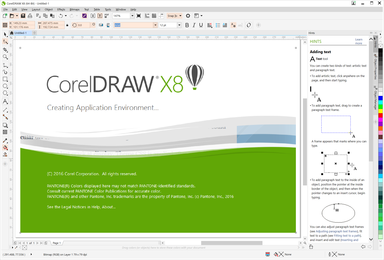
Corel Draw Open Screen

Pathfinder Function

The pathfinder tools in Corel Draw are wildly different to that in Illustrator. Though you can achieve similar tasks, I found theirs very difficult to get used to. 

It also seemed the outcome depended massively on how you had items selected layers/objects as opposed to how they were arranged in the layers panel. I may be wrong, however this seemed the case with me.

Some Exporting

Export options in Illustrator are without a doubt much easier to customise and navigate than in Corel. 

Firstly, the options in Illustrator are second to none. You can really hone in on how exactly you would like your file to be, not so much in Corel. 

Furthermore, often times when exporting you would unselect a box to find the file format had not changed as intended, and when flicking between tabs on export settings, the settings had not been saved at all. Very frustrating when you have a short timeline and just want to finish a job. 

Glitches

During my time using Corel Draw daily, I found the software to be much more prone to glitches than Illustrator. Though some of the files I was working with contained sometimes thousands of objects, it seemed Illustrator would handle this amount of objects much better than Corel Draw. I could sometimes experience crashes, or the software would become very slow. 

I would also have sometimes random occurrences where the colour decks/presets would reset, or that I was unable to save files. Though Illustrator has its fair share of this, I definitely experienced this more with Corel Draw. Though I do not feel it would be a problem for most, if you are working with large files and files with hundreds of objects, it could be. 


Conclusion

I don't believe in battles of the software in design. What I do think is with any good design software, it is only as good as the person using it. You must unlock its potential and push it to its limits. You have an idea, it's your job to get the tools to work to execute this idea as a designer. 

As a designer who becomes accustomed to using said software, I think you can easily get past the nuances of each. A good workman knows their tools, which is what I also try to attest to. 

Though I had access to both softwares, the reason I did not start to use Illustrator during my work for this job is because the company had only ever worked using Corel. All the files were in Corel Draw and converting them into Illustrator files meant that layer names and sometime arrangements were not bought across. There was also a larger team to bring over to Illustrator, than me to Corel. Therefore I learned to love it, and used it as a new string to my bow. 

I did for some complex vector graphics needed, sometimes use both in conjunction as I knew my initial vector skills lied with Illustrator in which I could work much faster and trust the pathfinder tools. I would then bring this into Corel. You would think with using both softwares for vector graphics one would get confused, however I did not find this to be the case. There is a function with Corel Draw to change the workspace so that it is more similar to Illustrator for new users, however I decided against this as I wanted to make sure I kept both separate in my head. 

Maybe one day I will be fortunate enough to use Corel Draw on the daily again. I had a lot of fun using it and it was another string to my bow. As a total new comer to the software it would have not been as easy, had I not had the knowledge of Illustrator to attempt similar tasks I may not have known where to start. It's a fantastic software, for a fraction of the cost overtime of Adobe. It is no wonder why many still swear by it. 


Monday, 6 November 2023

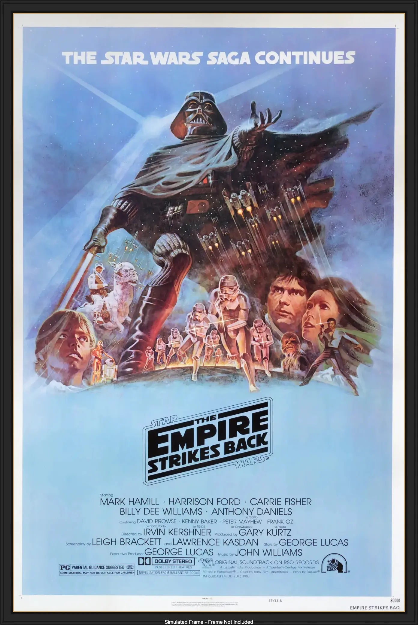
Why The Ensemble Movie Poster Design Will Never Get Old

Looking back at some 'Film Noir' inspired movie posters I created at college, I wanted to try my hand at creating movie posters again. One thing I have recently picked up on is a certain style/composition of movie posters that has been popular for years, the ensemble movie poster design

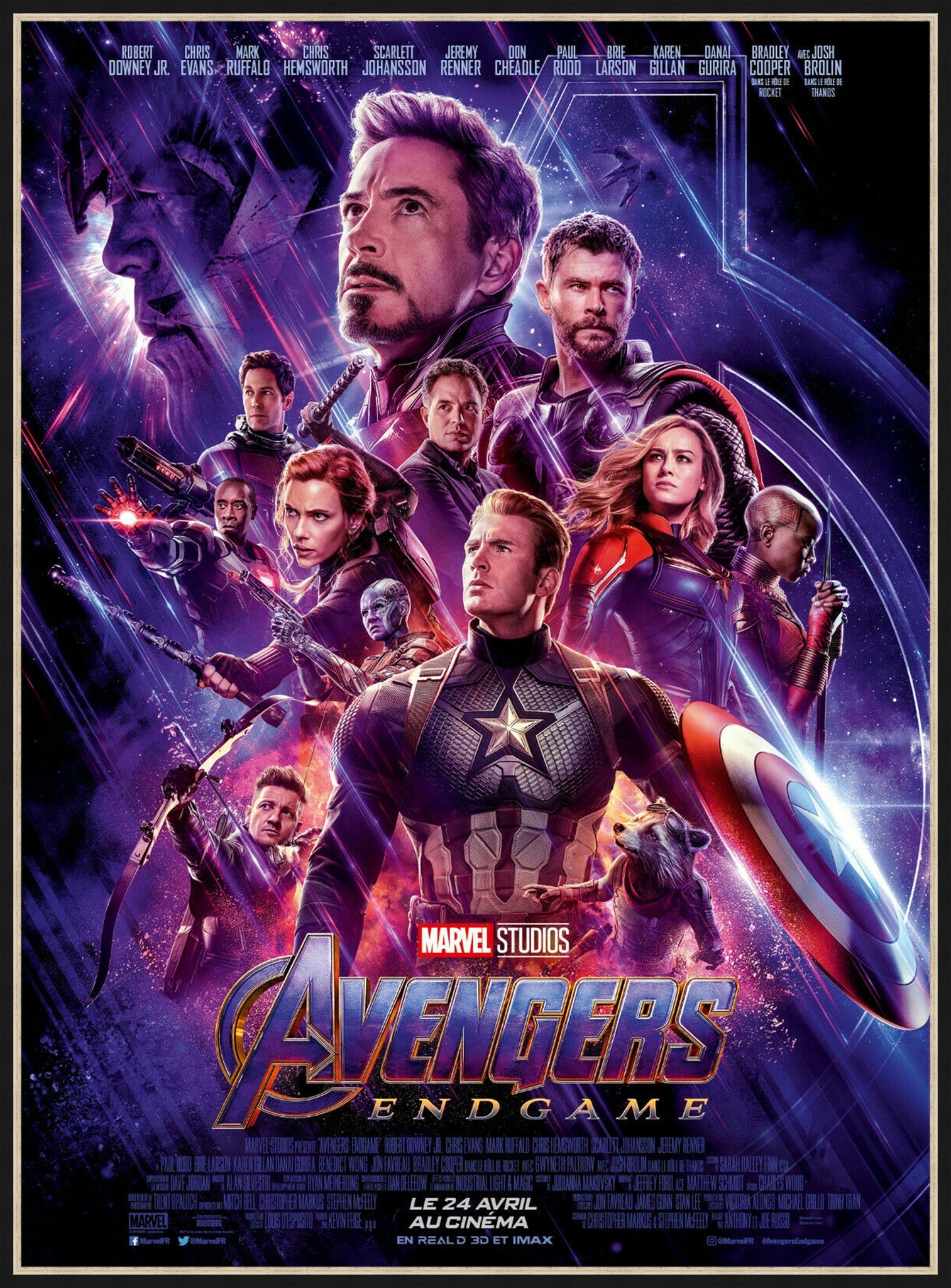
Avengers : End Game - 2019 - Original Movie Poster – Art of the Movies

Avengers Endgame, Ensemble Poster Design

Now I'm not sure if this is the design's official name, however a quick google search seemed to label it as so. If you're still wondering what the design looks like and what it actually is, you have come to the right place. There will be many examples to follow. 

What is the Ensemble movie poster design?

So loosely explained from what I gather, the ensemble movie poster design consists of characters and props compiled and layered around one another in an interesting way. A significant abuser of this poster design style are superhero movie posters, often displaying the most powerful hero, enemy or protagonist in a way I can only relate to the hierarchy of type. Interestingly, the characters that are often least present in the story are smaller within the composition. 

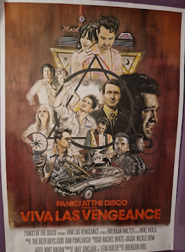
I have not only seen this on movie posters, I have to seen this on tour posters. See the Viva Las Vengeance Panic! At The Disco Tour poster below. This tour as with many relies heavily on lore and a storyline within music. The lights, imagery and staging tell as story, all tied together with the name. Though the tour is not a movie, it is depicted as one, using poses and outfits from music videos, and other band members as though they are part of the main cast. Talk about your life being a movie!


Viva Las Vengeance - P!ATD Tour Posters

The ensemble movie poster design is defiant to other styles and trends in design, in that it does not age. It is the composition that really makes it for the posters. Each time I see this design used I am in awe of how tidy a job the designer has done in piecing all the characters together. I am sure the design requires lots of trial and error, however it often seems like the designers from what I have seen have the ability to make the poster look as though the imagery used was made for it, as opposed to the other way round. 

In Popularity

Is this movie poster design over done, or is it a universal poster design composition that is just the right thing to do when it comes to marketing a blockbuster? Though it is common, I am on-board with its frequent use, and will most likely attempt similar as a passion project. Designers have achieved something that I often struggle with in every project, balance. Balancing all the imagery they must be provided with cannot be an easy task, getting the spacing and design elements just right. I find these kinds of posters particularly fascinating and am in awe of the effort they must take to piece all the imagery together in a composition that 'looks good'. 

Provided the little information there is in regard to this actual poster design style I could find, I can only hope for now that AI cannot and will not be able to achieve a similar effect for some time. Balance in art and design is a talent, and it takes patience. I can only strive to achieve such a balance amongst my own posters. 

I really enjoy seeing this poster style and look forward to attempting something similar myself. It could be a good practice in Photoshop to use for my portfolio, and if I don't end up using what I have made it may just end up being a good test of my patience. It could really go either way. 

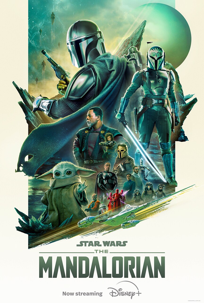
Some of my favourite ensemble posters:

Poster Gallery | The Mandalorian Season 3 | StarWars.comFortiaboot Threat Level Midnight Gaming - Poster print Wall 15 x 23 Inches  (38 x 58 cm) (380 x 580mm) Gift Decorative Print : Amazon.co.uk: Home &  Kitchen

The Empire Strikes Back (1980) Original Style B One-Sheet Movie Poster -  Original Film Art - Vintage Movie PostersKingsman: The Secret Service Review | F*** Magazine | Kingsman the secret  service, Kingsman, Secret service

https://www.starwars.com/the-mandalorian-s3-poster-gallery

https://www.amazon.co.uk/Threat-Midnight-Gaming-Poster-Decorative/dp/B099WCZQ46

https://www.originalfilmart.co.uk/collections/e/products/the-empire-strikes-back-1980-b?shpxid=9925f802-8cdb-4160-a7e9-720c9467ad59

https://www.pinterest.co.uk/pin/321937073339959011/

Last minute thought: Perhaps we can relate these posters to the hierarchy of type? In that the most prevalent/important character is largest alike a heading, with text and characters ranging from smallest to largest


Wednesday, 26 July 2023

The Wild World Of Food Truck Branding - Do our stomachs speak louder than a brand identity?

As a previous festival attendee and frequenter of food trucks, I can't help but ponder the thought process behind the signage and branding of the said food on offer. Recently I attended a music festival and though I was enjoying all that was on offer, waiting in line I found myself captivated by the decor choices on the food truck and the graphics they have chosen to run with.

Is it a case of the truck being at the right place at the right time, when your brain is craving sugar or your stomach longing for greasy foods?

Common themes I noticed within food truck branding:

Pop Art Theme

I saw this when looking at a breakfast and coffee place. The imagery was entirely unrelated to the items on the menu, featuring a pop art woman's face, with red lipstick and sunglasses at the end of her nose. Bright yellows, pinks, blues and halftone dots were used. The place was busy might I add. This could be due to the place being one of the closest breakfast places in the vicinity or perhaps that the customers were so astounded by the pop art branding they had to take a closer look. 

Rustic Theme 

Something I have noticed within food trucks that offer Yorkshire puddings, casseroles and gravy smothered items is that these trucks tend to take a more rustic approach to branding. Elements incorporated in these trucks are often wood effect backgrounds, with white text on what looks to imitate a chalkboard background. These trucks provide the same feeling as a cottage/farmyard kitchen, which I think is spot on for the food that is on sale here. 

Minimalist Theme

Trucks with coffees, ice tea and milkshakes on offer tend to go for a more minimal approach, often using san-serif typefaces and possess a smaller colour palette. Perhaps this is to achieve a look that is less busy and formal, for those on-the-go. The branding is not as overwhelming or loud as other themes explored. 

Fancy Theme

Trucks that sell sugary goods, such as cakes and donuts really hone in on Serif fonts, bright colours and graphics of sprinkles. Lots of hot pinks and cerulean blues on offer here. These trucks would heavily feature imagery related to the food on sale, such as donut patterns or a neon milkshake sign. 

I'm sure there are more themes, with the world of food truck branding possibilities being endless. However, these are the themes I had noticed were most prominent amongst the trucks. 

Does it matter? / What works

This question leads to another, what does branding do? What can it achieve for a brand? 

Well, consistent branding can create a more memorable experience for a customer, with effective and well executed branding, a truck may become more identifiable and stick in the customer's mind. Branding is there to impress and get attention. 

In relation to a festival or event, you need to ask if this matters as much. Many customer's are looking to get food that is tasty, and nearby. They will often seek out a truck due to distance and appealing choices, in spite of the imagery and branding. Smells of the food and how it looks when served is also important. These all draw a customer in. 

Yes, I think branding may appeal to some people. It will not hurt to have some consistent branding, especially after the festival or event is over to retain potential customers. However, I believe the execution of the signage and design rules cause a greater impact to footfall. A truck could feature minimal text, with few options and prices, yet following a type hierarchy with a bold font. As long as this food is delicious and the price is good, you can guarantee this truck is going to go down a treat. 

With a rise in easy-to-use apps and branding being on most products and advertisements, it is almost refreshing to visit somewhere that holds a good image, but not a visual one. A common misconception is that as a company you need a strong brand identity. As a graphic designer I do not believe in this, with food trucks to prove it. You can depending on the industry, have a successful business without what would be considered a somewhat polished or contemporary brand identity. Considering your customer base, location and what else your business has to offer can help decipher whether this is important or not. 

As the famous quotes goes, "a jack-of-all-trades, but a master of none" is definitely evident here. You may have great food, but it does not mean this will transfer into your branding, and it doesn't need to.

And that is literally food for thought.


Thursday, 22 June 2023

Creating 100 Fonts In 100 Days

This year is hopefully the year I start taking my hobbies and passions seriously, learning new skills and expanding my portfolio. I wanted to learn something new, and do it for a pro-longed period of time, so hopefully the new skills would stick. Furthermore, I wanted to give myself enough time to understand it and express myself creatively once I have practiced and perfected the method. 

Something I have wanted to try for a long time was to create a font, understanding how to get a font to work and dive deeper into the world of typography with my own bespoke typeface. Being a frequent user of all popular social media platforms, I have seen other creatives for a long time posting their own fonts and typographic designs. Why couldn't I do this, and really commit myself to a project? 

This is where the 100 Fonts In 100 Days came to fruition. 

The day was April 2nd, and I had until July 11th to create 100 fonts. If dividing the fonts by day, I had to create 1 a day to keep myself afloat with the workload. However, given my personal life and other unknown challenges life can sometimes throw your way, I knew this was not always possible, and I may sometimes have to step up the amount I were to produce. 

It is important to note that at the beginning of this project, I did not know how to create a working font. Having studied Graphic Design and designing in my day job, I am familiar with vector drawing software, so knew I would comfortably be able to design and digitise any lettering. With good software skills, I was comfortable in my ability to design fonts going forward, but to create a working one was a different ball game. 

Having completed a vast amount of research, I discovered free font editing software FontForge (not spon) which would allow me to convert svgs and other file formats into a working font. Using FontForge, you are able to design directly into the software, edit existing fonts, control spacing between lettering and a whole host of other features I am sure I have yet to discover and experience for myself. 

Every letter, symbol or punctuation mark typed on a keyboard is known as a glyph. Most widely-used fonts can include 10s of thousands of glyphs, covering upper and lowercase, marks as well as characters used in different languages. On the other hand, many stylised fonts found on free-use font websites can contain anything from the immediate English alphabet to a few hundred. Working on the immediate alphabet is what I would be trying to achieve with these fonts, as they are not intended for use commercially nor widely. Tackling just the English alphabet and perhaps some punctuation marks would be more achievable given the timeframe. I would also have more time on each letter and font, being able to play and experiment with different shapes and styles as I see fit. 

Preparing fonts digitally and by hand

When designing a set of glyphs or whole font, I used methods that were both digital and by hand. To keep my glyphs in proportion in terms of size width and in upper and lower case, I needed to draw each character using guides. Possessing just A4 paper to hand draw out glyphs, I created a grid as seen below which allows you to create 56 glyphs per piece of paper. 


  • Measurements are 7inches across by 28cm down. This is the easiest way I managed to measure using a standard 30cm ruler. 
Creating horizontal lines 3.5cm down until the end, should give you these boxes:


These lines and boxes will act as a guide for your lower and uppercase characters. Although depending on the style you are going form you may not necessarily need to stick to these. Your font could be abstract and not conform to any kind of linear pattern. The choice is yours. 

  • This is what you are going for with your lines. These could be created digitally on a hidden layer, or by hand which is what is the method I used the most. 

It is best to draw your lines vertically and horizontally across the paper, instead of working box by box. Hopefully they are helpful in helping you line up your glyphs. As with doing most things by hand, you may perhaps jolt your hand and the outcome may be slightly off. Don't worry much if lines are slightly off, as characters when digitised can always be edited in Illustrator.

How I created each glyph for a font

Upon sketching my glyphs digitally or by hand, once vectored I created a separate SVG file using Adobe Illustrator's export features. Every individual letter, number or symbol needs to be its own file. The reason I choose to export in an SVG format is because it is supported by FontForge, recommended by other font creators and I was also already familiar with the file type. You do not necessarily need to use Illustrator for this. Any vector image software that allows you to export your work as SVGs should in theory work. 


  • The above image is of font 31 Lucy Goosey. I hand drew each glyph and used Illustrator to vectorise each glyph.
Using hand drawn glyphs you have 2 options: digitally recreate the shapes one by one, or pick up the shapes using Image Trace. Illustrator's Image Trace feature really came in clutch for vectorising chunky glyphs that could be picked up easily by the feature. The trick is to make sure your scan has a high contrast so that the black is more distinguishable against the white on scan. If the pencil marks are picked up, use Illustrator's handy eraser tool or direct selection tool to delete any unwanted nodes/paths.


  • It is also a good idea to create glyphs as a stroke, as this will allow you to explore using Illustrator's default brush options in your fonts. Remember to merge all shapes and outline your stroke once complete

To create each glyph/character as its own file, go to File > New in any software and create an artboard that is small enough to accommodate your letters. You can use the same measurements as the width and height of each glyph box. (25.4mmWx 35mmH)


  • Paste in an upper and lowercase letter to line up glyphs. You can vertically align these so the bottom of each letter meets, and drag to create a guide, like so. You now know where your ascender and descender lines sit. 


  • Now you have your letter where you want it, centralised on the artboard, go ahead and export your letters as SVGs. 


  • These are Illustrators default SVG settings used on export for each SVG

These SVGs are then imported into FontForge and assigned to their appropriate character or glyph. 

I will touch on how I have imported and create fonts in the appropriate softwares, however I will not go into too much depth. There are already existing guides online on how to use FontForge and Glyphter, the two programs I have used. if you would like to see how these work, please research these via Google or Youtube, and many other knowledgable creatives will go into great depth. This is how I learned. 

Using Fontforge - Free Font editing software


  • Creating a new file in Fontforge, it will at first open blank. Yet this is my window once I have imported each Glyph. Double click on a blank box to open that character. 

  • File > Import will bring up the file explorer on windows or Mac. Use the directory to find where you have saved your SVGs. Select the appropriately named character and open this in FontForge. 

  • The letter should open like this, showing all the nodes/paths of your glyph. Use the guides to play around with spacing, base lines etc. Close this window to go back to your glyph set and repeat the process for each letter. 
*Please note, to create the space bar glyph you need to set the spacing on character/glyph number on character 33. No SVG is needed to be imported. 


  • Element > Font Info will allow you to edit the font name, family names or weight name of your created font. There are lots of other things to edit here too, but these are the basics you will be editing in this tab. 


  • Finally File > Generate Fonts will allow you to generate your font in the format of your choosing. You can then install this font and use to your heart's content. Thus concludes a short guide to FontForge. 

Using Glyphter - The SVG Font Machine

Another useful tool instead of FontForge was SVG font site Glyphter. A self proclaimed SVG font-machine  easily allows you to drag and drop your SVG glyphs onto the webpage, automatically spacing each glyph for you. The site provides some customisation options but not as much as FontForge. There are possible more features in the paid version, but in the free version you are able to create fonts with no account in a Truetype format. 


  • Using Glyphter is fairly self-explanatory, once you have drag and dropped all glyphs in place, you name your font in the top left text box and click the red FONT button next to it to download. 

Glyphter was used extensively later on in the project, when creating fonts with few glyphs and spacing that I did not feel needed much work. The online tool is great and can be used to make a quick font, especially for beginners. 

Fonts 1-100


1. Guinea Pig , 2. Arial PiƱata , 3. Disorder , 4. IM CURVY AND I LIKE IT , 5. Molecools , 6. Let's Eloope , 7. Hedgehog , 8. Let's Get Sketchy , 9. Inside D Box , 10. Outside D Box , 11. Loop De Loop , 12. Ripple , 13. Words Grow , 14. Words Bloom , 15. Snake Negative , 16. Snake Positive , 17. Whatever Floats Your Boat , 18. Thingbat 1 , 19. STAY AWAY , 20. Feeling Fonty , 21. Flatpack , 22. Shuttling , 23. Quick Warp , 24. SHOWBIZ BABY , 25. Crimble Crumple , 26. Blade Parade , 27. Satellites , 28. Round Trip , 29. Mosaick , 30. Outside Looking In , 31. Lucy Goosey , 32. Two Right Feet , 33. Poor Man's Scrabble , 34. HANDS OFF , 35. La flick c'est chique , 36. Azure Window , 37. Stars In Your Is , 38. Pointing Is Rude , 39. Funetics , 40. Mini Roo , 41. Stencilio , 42. Copybook , 43. Tipsy Turvy , 44. Pogo Sticks , 45. H Eye J , 46. Act Natural , 47. Impurrfectly Purrfect , 48. Wring A Rosie , 49. New Squeeze , 50. Cloudy , 51. Detective Irregular , 52. Cubey , 53. Let's Twist Again , 54. Charky , 55. Flame Thrower , 56. Museum , 57. Cowlick , 58. So you think I am skinny , 59. Balloon Artist , 60. Skritti , 61. Hattie , 62. Shoeie , 63. HAY NOW , 64. Outerspace , 65. Innerspace , 66. Sweeties , 67. Stone Art , 68. Tearbat , 69. Sticky Sticky Stick Stick , 70. Bunny Ears , 71. Curly Fries , 72. Beady Boi , 73. Shape Up And Ship Out , 74. Interlock , 75. MOOP , 76. Cusp , 77. Thin Lizzie , 78. Sergeant Angle , 79. Street Ghoul , 80. Heart2Heart , 81. Crinkle Cut , 82. Shake It , 83. Shadow Lines , 84. Threading The Needle , 85. Hmm , 86. Soft Serve , 87. Spring In Your Step , 88. High Voltage , 89. Digit All , 90. WrongWay , 91. Warp Town , 92. Pretty Petals , 93. Ziggy , 94. Backcomb , 95. Wobble Wobble , 96. Play Time , 97. Sticky , 98. Rickety , 99. Tissue Paper , 100. Celtic Type

One of the parts I strangely enjoyed about this challenge is naming each font. As you can see from my list of names, I had a preference for puns and pop-culture references in relation to the font. Some fonts are more obvious than others in terms of the reasoning for the name. Out of the 100 names, I did not seem to get stuck on naming any of the fonts. All names came fairly quickly, I guess once I had the overall idea for the font and what it was going to be, this put me in a good headspace to easily name it. 

The Highlights

My top 5 favourite fonts of those created were as follows:

  • No 8. Let's Get Sketchy


This font was the first I had created that I felt was rather easy to make and that also resembled itself exactly as I had pictured the font to be. Drawing back and forth over the letters to create a rough and sketchy effect within the lettering, this was picked up rather well via Illustrator's image trace function. I did not have to do much editing of the lettering at all, once vectored by this feature. The name is a play on words, and I did indeed "get sketchy" with my type. 

  • No 28. Round Trip


I perhaps have a preference for the Round Trip, for similar reasons to Let's Get Sketchy. I wanted the lettering to be constructed with rounded shapes, going for a sketchy style once again. Circling round and round each shape when sketching out the letters, each glyph appears rough and ready with imperfect lineage. The lettering also seems quite playful with the rounded chunky shapes alike that of a balloon. I would later attempt to replicate this balloon like shape in font 58, Balloon Artist.

  • No 31. Lucy Goosey


The lettering for this font tends to take on the form of long thin neck lines and a chunky head, alike that of a goose. Hence the name, Lucy Goosey replicates a goose's form in some respect. The font catches the eye, with a thick weight and rounded ends, consisting of fun curves with almost no straight lines to be seen. 

  • No 66. Sweeties
Picturing the idea of love heart sweets and the lettering included on these I had a similar idea to create a candy/sweet dingbat font. Instead, I adapted on this idea, creating spherical shapes with lettering inside, alike that of a skittle or other rounded confectionery. The alphabet created for this font is rather interesting, with letters such as "O" looking as though it is a piece of liquorice. The glyphs also appear negatively within the circles which is unique to other fonts I had previously completed. 

  • No 79. Street Ghoul
In creating this font I did not have a particular idea in mind. I began to sketch out the first letter A, making the letter end into a point. I repeated this shaping for all other letters as though they were the end of a flame converging into smoke, or a floating ghostlike figure who's body is ending off into a point. The initial result I thought looked similar to that of Graffiti lettering I had recently seen, which could have subconsciously been the inspiration behind my expression. Therefore, combining these two ideas of a street art and a mischievous night creature, I settled on the aptly named Street Ghoul. 


Series I watched during this challenge

  • Superstore

As someone who has worked in retail for several years, the perils of working in this industry and customer interactions are spot on. My favourite character is Dina and the storyline between Jonah and May and the cast as friends was so beautiful and well played out. Working in a store and with the general public is not the best at times, but it is the people you work with that really make it what it is. I think that's what this show is all about. Now one of my comfort series.

  • Emily In Paris

2 words: TEAM ALFIE

  • It’s Always Sunny In Philadelphia

This sitcom is so different from any others I have watched, each episode I find effortlessly hilarious. Having looked back from the first to the latest season and how the story has progressed, none of the main characters are really any further in their lives than before. The main characters are for the most part psychopaths and do not amount to anything, but that is part of the humour of it all. This show is not for everyone, but it is one for me.

  • How I Met Your Father

A long time fan of HIMYM, I thought I would give HIMYF a try. Sophie and Valentina's friendship reminds myself of a close friend of mine. Charlie and Ellen make for some funny scenarios throughout the show also. it is only half way through season 2, so the story is yet to really progress. I eagerly await to see where this series will go.

  • Welcome To Wrexham

Watching Ryan Reynolds and Rob McElhenney own and help run a struggling football team has really opened my mind into the perks and perils of a football career. I was unaware of the technicalities of getting into certain football leagues, how long it would take and just surprised at the overall cost it would be to create a grounds that is up to scratch for Wrexham. I have really enjoyed watching the Wrexham team and community going from strength to strength and look forward to watching them make their way through the leagues.

  • I Think You Should Leave

This programme is an easy watch with short episodes and hilarious skits. The humour in this show is not everyone's cup of tea, but if you enjoy existential humour and satire you will enjoy this show. My favourite sketch thus far has got to be 'Doggy Door'.


Without these series to keep myself entertained during the monotonous file preparation, I would not be where I am today, with 100 fonts and numerous glyphs taking up space on my hard drive. I have watched more new series and TV throughout this challenge than I watched in the entirety of last year.


Statistics

Working fonts completed: 100

Serif fonts completed:12

Sans-serif fonts completed:Over 72*

Dingbat fonts completed:8

Script fonts completed:2

Total glyphs created: 3289

New softwares discovered: 2


*The categorisation of fonts may not be entirely accurate. It is hard to describe and categorise some fonts being they could sit between two categories.


Hours of new TV binged: Approximately 144 hrs, or 6 days. 


I don't think I have ever consumed this much consecutive television in my lifetime.


Times almost given up: Many many times, I don't have a number


Conclusion

Glad that I decided to push through and see the project to a full 100 font library, starting at number 1 even just the first font seemed like such a mammoth task. Once I became comfortable and more confident in my method, making a font did not seem so difficult and I was able to be more experimental with my work. 

I realise the important of setting myself tasks such as these as a designer. Often times if you are pursuing the creative industries as a job, you do not get to experiment and try new things on your own terms. Doing projects like this allows you to learn something new and express yourself freely as a designer. 

Having the ability to create bespoke fonts, after creating 100 I think I will leave it for a little while. I am going to look to use my 5 favourites in my own graphic design projects. Stayed tuned for these projects as and when they come. 

For now, you can find my Instagram @neev.be to keep up with my latest work.


Things I Enjoyed About Design In 2023

As we take another journey around the sun, it's often a time we choose to reflect on our work, the work of  others and what we would lik...