Looking back at some 'Film Noir' inspired movie posters I created at college, I wanted to try my hand at creating movie posters again. One thing I have recently picked up on is a certain style/composition of movie posters that has been popular for years, the ensemble movie poster design.
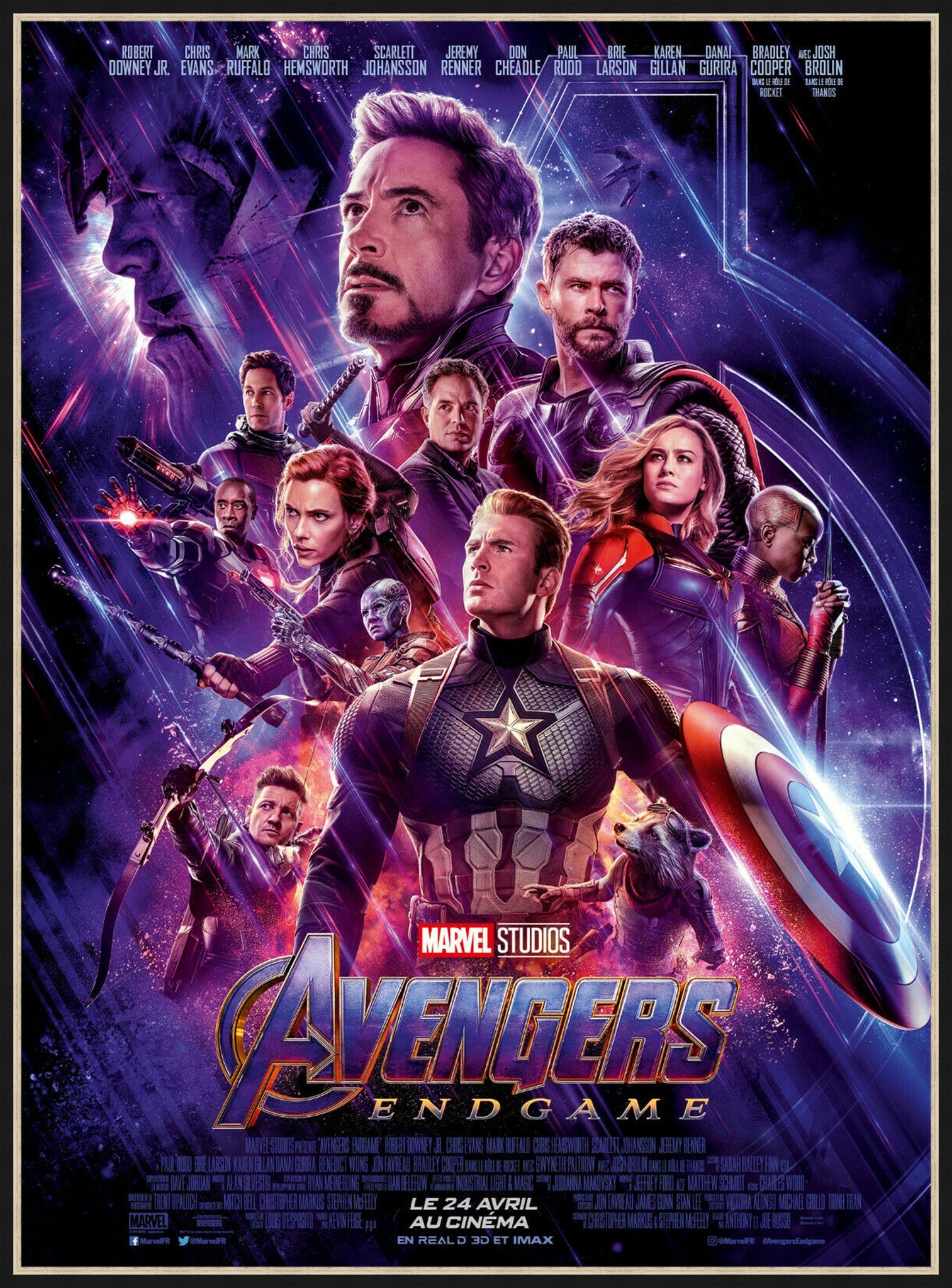
Avengers Endgame, Ensemble Poster Design
Now I'm not sure if this is the design's official name, however a quick google search seemed to label it as so. If you're still wondering what the design looks like and what it actually is, you have come to the right place. There will be many examples to follow.
What is the Ensemble movie poster design?
So loosely explained from what I gather, the ensemble movie poster design consists of characters and props compiled and layered around one another in an interesting way. A significant abuser of this poster design style are superhero movie posters, often displaying the most powerful hero, enemy or protagonist in a way I can only relate to the hierarchy of type. Interestingly, the characters that are often least present in the story are smaller within the composition.
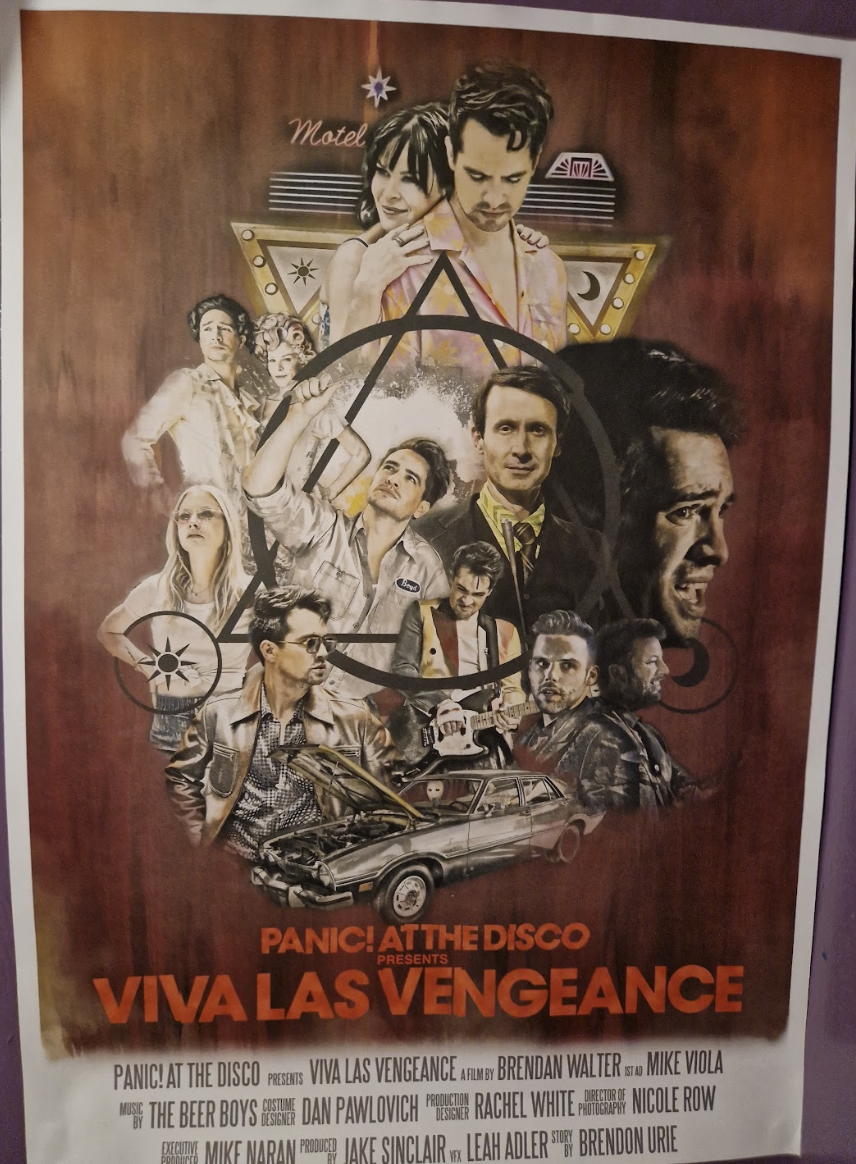
I have not only seen this on movie posters, I have to seen this on tour posters. See the Viva Las Vengeance Panic! At The Disco Tour poster below. This tour as with many relies heavily on lore and a storyline within music. The lights, imagery and staging tell as story, all tied together with the name. Though the tour is not a movie, it is depicted as one, using poses and outfits from music videos, and other band members as though they are part of the main cast. Talk about your life being a movie!
The ensemble movie poster design is defiant to other styles and trends in design, in that it does not age. It is the composition that really makes it for the posters. Each time I see this design used I am in awe of how tidy a job the designer has done in piecing all the characters together. I am sure the design requires lots of trial and error, however it often seems like the designers from what I have seen have the ability to make the poster look as though the imagery used was made for it, as opposed to the other way round.
In Popularity
Is this movie poster design over done, or is it a universal poster design composition that is just the right thing to do when it comes to marketing a blockbuster? Though it is common, I am on-board with its frequent use, and will most likely attempt similar as a passion project. Designers have achieved something that I often struggle with in every project, balance. Balancing all the imagery they must be provided with cannot be an easy task, getting the spacing and design elements just right. I find these kinds of posters particularly fascinating and am in awe of the effort they must take to piece all the imagery together in a composition that 'looks good'.
Provided the little information there is in regard to this actual poster design style I could find, I can only hope for now that AI cannot and will not be able to achieve a similar effect for some time. Balance in art and design is a talent, and it takes patience. I can only strive to achieve such a balance amongst my own posters.
I really enjoy seeing this poster style and look forward to attempting something similar myself. It could be a good practice in Photoshop to use for my portfolio, and if I don't end up using what I have made it may just end up being a good test of my patience. It could really go either way.
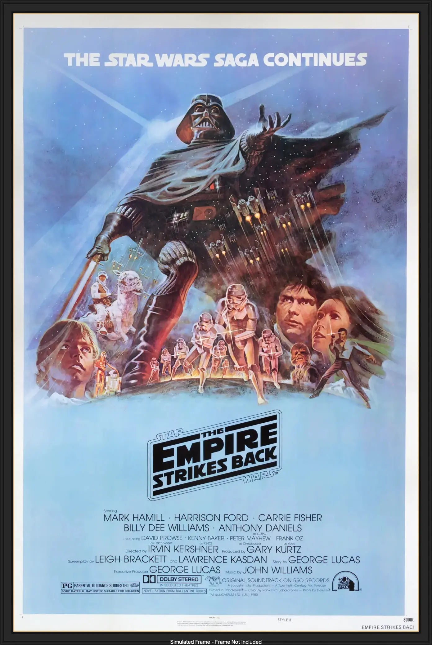
Some of my favourite ensemble posters:
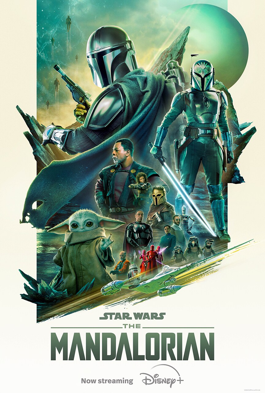


https://www.starwars.com/the-mandalorian-s3-poster-gallery
https://www.amazon.co.uk/Threat-Midnight-Gaming-Poster-Decorative/dp/B099WCZQ46
https://www.pinterest.co.uk/pin/321937073339959011/
Last minute thought: Perhaps we can relate these posters to the hierarchy of type? In that the most prevalent/important character is largest alike a heading, with text and characters ranging from smallest to largest


No comments:
Post a Comment