My working life within Graphic Design is only just beginning, however during my time in the workplace I have worked using both the Adobe Suite of software and the Corel Draw suite on the daily. As the old saying goes, you don't know what you've got till it's gone, and this is something I think of when remembering my time using Corel Draw.
Though I used Corel in my day job, I made sure that I equally used Illustrator at home as knowing this to be the so called "industry standard", I needed to keep my skills within this software up-to-date and equally as sharp.
It doesn't keep me up at night, however I do think often of the tools and functions that won me over as opposed to Illustrator, with some of the extra clicking I'm doing. There are many different suites of software you can use in terms of digital art and design, however, these are the two I have spent most time, sweat and tears on, therefore I can confidently discuss my experience with the nuances of using both, what I liked and what I did not.
Functions I liked:

Powerclip Image
Powerclips
Creating Powerclips in Corel Draw is something I accidentally stumbled upon. They are so easy to use, with any shape/vector being able to act as a frame, similar to creating clipping masks. Your artwork can simply be highlighted and using the toolbar made into a clipping mask. You then simply select the shape you would like to place your art into and it is done.
The significance of this drag and drop easy function as opposed to clipping masks, is that you don't need to worry about the arrangement/placement in layers as you would a clipping mask.
As long as you can see both the shape and the content you would like to place into it, you can simply click on the shape and your art will be placed inside. SO EASY.
The name is also really cool. Powerclip. It just has an oomph to it that Clipping Mask doesn't.
Though clipping mask does get a point for being more obvious in what it is for.

Keyboard and Mouse
The almighty Right Click functions
Right click for stroke
If you have selected an object and would like to change the stroke colour, you simply right click on the colour palette to change its stroke colour. Left click for the fill. How simple and definitive. I found this so easy to get used to and had many a moment then in Adobe where I would go to do the same thing.
It makes so much sense and is so much quicker than any other way of changing the stroke in Illustrator.
Right click to duplicate
When selecting an object, if you click and hold then right click also you can duplicate your object. I just find these right click functions so quick and clever. Though you can hold alt or option on your keyboard to duplicate in Illustrator, why involve another button when it is easier to have more functions in the mouse. Though not much time is saved, it definitely feels much quicker.
Functions I did not like
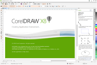
Corel Draw Open Screen
Pathfinder Function
The pathfinder tools in Corel Draw are wildly different to that in Illustrator. Though you can achieve similar tasks, I found theirs very difficult to get used to.
It also seemed the outcome depended massively on how you had items selected layers/objects as opposed to how they were arranged in the layers panel. I may be wrong, however this seemed the case with me.
Some Exporting
Export options in Illustrator are without a doubt much easier to customise and navigate than in Corel.
Firstly, the options in Illustrator are second to none. You can really hone in on how exactly you would like your file to be, not so much in Corel.
Furthermore, often times when exporting you would unselect a box to find the file format had not changed as intended, and when flicking between tabs on export settings, the settings had not been saved at all. Very frustrating when you have a short timeline and just want to finish a job.
Glitches
During my time using Corel Draw daily, I found the software to be much more prone to glitches than Illustrator. Though some of the files I was working with contained sometimes thousands of objects, it seemed Illustrator would handle this amount of objects much better than Corel Draw. I could sometimes experience crashes, or the software would become very slow.
I would also have sometimes random occurrences where the colour decks/presets would reset, or that I was unable to save files. Though Illustrator has its fair share of this, I definitely experienced this more with Corel Draw. Though I do not feel it would be a problem for most, if you are working with large files and files with hundreds of objects, it could be.
Conclusion
I don't believe in battles of the software in design. What I do think is with any good design software, it is only as good as the person using it. You must unlock its potential and push it to its limits. You have an idea, it's your job to get the tools to work to execute this idea as a designer.
As a designer who becomes accustomed to using said software, I think you can easily get past the nuances of each. A good workman knows their tools, which is what I also try to attest to.
Though I had access to both softwares, the reason I did not start to use Illustrator during my work for this job is because the company had only ever worked using Corel. All the files were in Corel Draw and converting them into Illustrator files meant that layer names and sometime arrangements were not bought across. There was also a larger team to bring over to Illustrator, than me to Corel. Therefore I learned to love it, and used it as a new string to my bow.
I did for some complex vector graphics needed, sometimes use both in conjunction as I knew my initial vector skills lied with Illustrator in which I could work much faster and trust the pathfinder tools. I would then bring this into Corel. You would think with using both softwares for vector graphics one would get confused, however I did not find this to be the case. There is a function with Corel Draw to change the workspace so that it is more similar to Illustrator for new users, however I decided against this as I wanted to make sure I kept both separate in my head.
Maybe one day I will be fortunate enough to use Corel Draw on the daily again. I had a lot of fun using it and it was another string to my bow. As a total new comer to the software it would have not been as easy, had I not had the knowledge of Illustrator to attempt similar tasks I may not have known where to start. It's a fantastic software, for a fraction of the cost overtime of Adobe. It is no wonder why many still swear by it.
